Loading...
ArchiveBusiness
The Best SaaS Pricing Page Layouts for Maximizing Conversions Based on A/B Testing
This is an archived article from the previous version of this site. It is preserved here for reference.
When I think about the world of Software as a Service (SaaS), one of the first things that comes to mind is the critical role of pricing pages. These pages serve as the gateway for potential customers, acting as a bridge between curiosity and conversion. A well-designed pricing page can make all the difference in whether a visitor decides to sign up or bounce away.
It’s not just about listing prices; it’s about crafting an experience that resonates with users, addresses their pain points, and ultimately drives them to take action. The layout of a pricing page can significantly influence user behavior. I’ve seen countless examples where a simple tweak in design or content led to a substantial increase in conversions.
The challenge lies in understanding what elements work best for your audience. Each SaaS company has its unique value proposition, and the pricing page must reflect that while also being intuitive and engaging. As I dive deeper into this topic, I’ll explore the importance of A/B testing, key elements to include, and share insights from successful case studies that highlight effective strategies.
Key Takeaways
- SaaS pricing page layouts play a crucial role in converting visitors into customers.
- A/B testing is essential for optimizing SaaS pricing pages and maximizing conversions.
- Key elements such as clear pricing, value proposition, and social proof should be included in SaaS pricing page layouts.
- A/B testing results reveal top SaaS pricing page layouts for maximizing conversions, providing valuable insights for SaaS companies.
- Case studies showcase successful SaaS pricing page layouts and their impact on conversion rates, offering practical examples for SaaS businesses.
The Importance of A/B Testing for SaaS Pricing Pages
A/B testing is like the secret sauce for optimizing SaaS pricing pages. It allows me to experiment with different layouts, copy, and calls to action to see what resonates most with my audience. By comparing two versions of a page, I can gather data on user behavior and make informed decisions based on real-world results rather than assumptions.
This process is invaluable because it takes the guesswork out of design and strategy. What I find particularly fascinating about A/B testing is its ability to reveal insights that I might not have considered. For instance, a slight change in wording or the placement of a button can lead to significant shifts in conversion rates.
It’s not just about finding what looks good; it’s about understanding what drives users to engage and ultimately convert. By continuously testing and iterating, I can refine my pricing page to better meet the needs of my target audience, ensuring that I’m not just attracting visitors but converting them into loyal customers.
Key Elements to Include in SaaS Pricing Page Layouts
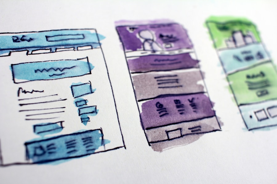
Creating an effective SaaS pricing page requires careful consideration of several key elements. First and foremost, clarity is essential. I want potential customers to understand exactly what they’re getting for their money without any confusion.
This means clearly outlining features, benefits, and pricing tiers in a way that’s easy to digest. Using bullet points or tables can help break down complex information into manageable chunks. Another critical element is social proof.
Including testimonials, case studies, or logos of well-known clients can build trust and credibility. When I see that others have successfully used a product, it gives me confidence in my decision-making process. Additionally, incorporating a clear call to action (CTA) is vital.
Whether it’s “Start Free Trial” or “Get Started,” the CTA should stand out and encourage users to take the next step. The placement and design of the CTA can significantly impact its effectiveness, so I always pay close attention to how it fits within the overall layout. Source: Crazy Egg
A/B Testing Results: Top SaaS Pricing Page Layouts for Maximizing Conversions
After conducting numerous A/B tests on various pricing pages, I’ve come across some standout layouts that consistently yield high conversion rates. One effective approach involves using a tiered pricing structure that clearly delineates different levels of service. This layout not only helps users understand their options but also encourages them to consider higher-priced tiers by highlighting additional features and benefits.
Another successful strategy I’ve observed is the use of a comparison table. By placing different pricing plans side by side, I can help users easily evaluate their choices. This layout allows me to emphasize the value of each plan while guiding users toward the option that best fits their needs.
Additionally, incorporating visual elements like icons or graphics can enhance engagement and make the information more appealing.
Case Studies: Successful SaaS Pricing Page Layouts
Looking at real-world examples can provide valuable insights into what works in SaaS pricing page layouts. One case that stands out is Slack’s pricing page. They utilize a clean design with clear headings and concise descriptions for each plan. Their approach effectively communicates value while making it easy for potential customers to navigate their options. Another compelling case is HubSpot, which employs a comparison table that highlights the differences between their various plans.
This layout not only simplifies decision-making for users but also emphasizes the benefits of upgrading to higher tiers. By showcasing popular features and including customer testimonials, HubSpot builds trust and encourages conversions. These examples illustrate how thoughtful design and strategic content can lead to successful outcomes in SaaS pricing pages.
Tips for Implementing A/B Testing on SaaS Pricing Pages
Start Small and Focus on One Element at a Time
Rather than overhauling an entire page at once, I focus on testing one element at a time, such as the color of a CTA button or the wording of a headline. This approach allows me to isolate variables and understand their impact on user behavior more effectively.Set Clear Goals for Each Test
Another crucial aspect is setting clear goals for each test. Whether it's increasing click-through rates or boosting sign-ups, having specific objectives helps me measure success accurately.Ensure Statistically Significant Results
Additionally, I always ensure that I have enough traffic to achieve statistically significant results before drawing conclusions from my tests. By following these guidelines, I can create a structured A/B testing process that leads to meaningful insights and improvements.Common Mistakes to Avoid in SaaS Pricing Page Layouts
Even with the best intentions, it’s easy to fall into common pitfalls when designing SaaS pricing pages. One mistake I often see is overwhelming users with too much information at once. While it’s important to provide details about features and benefits, cluttering the page with excessive text or visuals can lead to confusion and frustration.
Striking a balance between informative content and clean design is essential. Another frequent misstep is neglecting mobile optimization. With an increasing number of users accessing websites via mobile devices, ensuring that my pricing page is responsive and user-friendly on smaller screens is non-negotiable.
If potential customers struggle to navigate or read content on their phones, they’re likely to abandon the page altogether. By prioritizing mobile optimization, I can capture a broader audience and enhance overall user experience.
The Future of SaaS Pricing Page Layouts and A/B Testing
As I reflect on the evolution of SaaS pricing page layouts, it’s clear that adaptability will be key moving forward. The landscape is constantly changing, with new trends emerging and user preferences shifting. Embracing A/B testing as an ongoing practice will allow me to stay ahead of the curve and continuously refine my approach based on data-driven insights. Tailoring content and offers based on user behavior and preferences could enhance engagement and conversion rates even further. By remaining open to experimentation and innovation, I can ensure that my pricing pages not only meet current demands but also anticipate future trends in the ever-evolving world of SaaS.
If you're interested in learning more about the crucial role of product vision and communication in product management, check out this article on Ratomir's blog. It delves into how having a clear product vision and effective communication can greatly impact the success of a product. This article provides valuable insights for product managers looking to improve their strategies and drive better results.